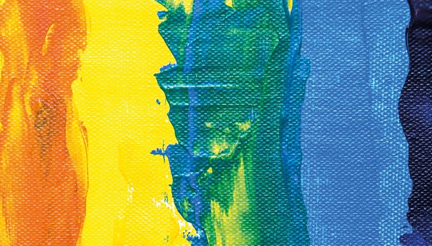
Colour is a surprisingly powerful communication tool – it elicits strong and varied mood and emotions in individuals, and has long been the ultimate tool of a wide variety of artists, from classical painters to modern interior designers, to create bespoke masterpieces, evoking a plethora of human reactions.
There are certain colours which are often associated certain behaviour; black is generally seen as mysterious or dangerous, red can be associated with passion or hostility. Greens often create a peaceful feeling, yellows are happy and sunny, and blues and other cooler colours are recognised as calming.
Despite these general associations, colour is often thought of as subjective, and your personally preferred hues may conjure up individual reactions and memories. The effect colour can have on our mood, emotions and even productivity levels is often hugely overlooked, particularly in workplace design – even the small touches of colour in the environment from furniture, fixtures or digital tools can be a major benefit (or, if chosen incorrectly, a major hindrance).
“Colours ability to stimulate or soothe is based on its intensity or saturation.” – Angela Wright, Productivity Specialist
It’s not a black and white world. How does colour impact our productivity? Colour in the workplace, no matter how subtle, plays a part in employee productivity.
Eighty percent of office workers believe colours impacts their mood – Interaction
Colour can improve readership by 40%, learning from 55 to 78%, and comprehension by 73%
A study from the University of Toronto, based on Adobe Kuler usage, showed that most of the people preferred simple colour combinations, usually just 2 to 3 favourite colours.
The best colours for the digital workspace
According to research, men and women often react differently to the same colour, with men feeling stressed and oppressed by orange and purple tones on workspace walls, and women feeling the same about dull grey shades. To err on the side of caution, when decorating a workspace, you cannot go wrong with using nature for the inspiration of your colour palette – peaceful, calming and easy on the eyes, the blues and greens that commonly occur in nature can help improve the mood of your workforce. Add in natural textures, such as wood and cotton, and you’ll likely see a less-stressful office environment overall.
In a single glance
When you are scrolling through your newsfeed on social media, what catches your eye? Typically, it will be something with vibrant colour such as a video, infographic or gif.
Similarly, in the workplace, being able to see a document, spreadsheet or an online grid in an eye-catching colour instantly makes it easier to use and navigate.
This is exactly why, when Condeco users requested an update to the booking grid on our room booking software, we didn’t hesitate to add coloured tabs!
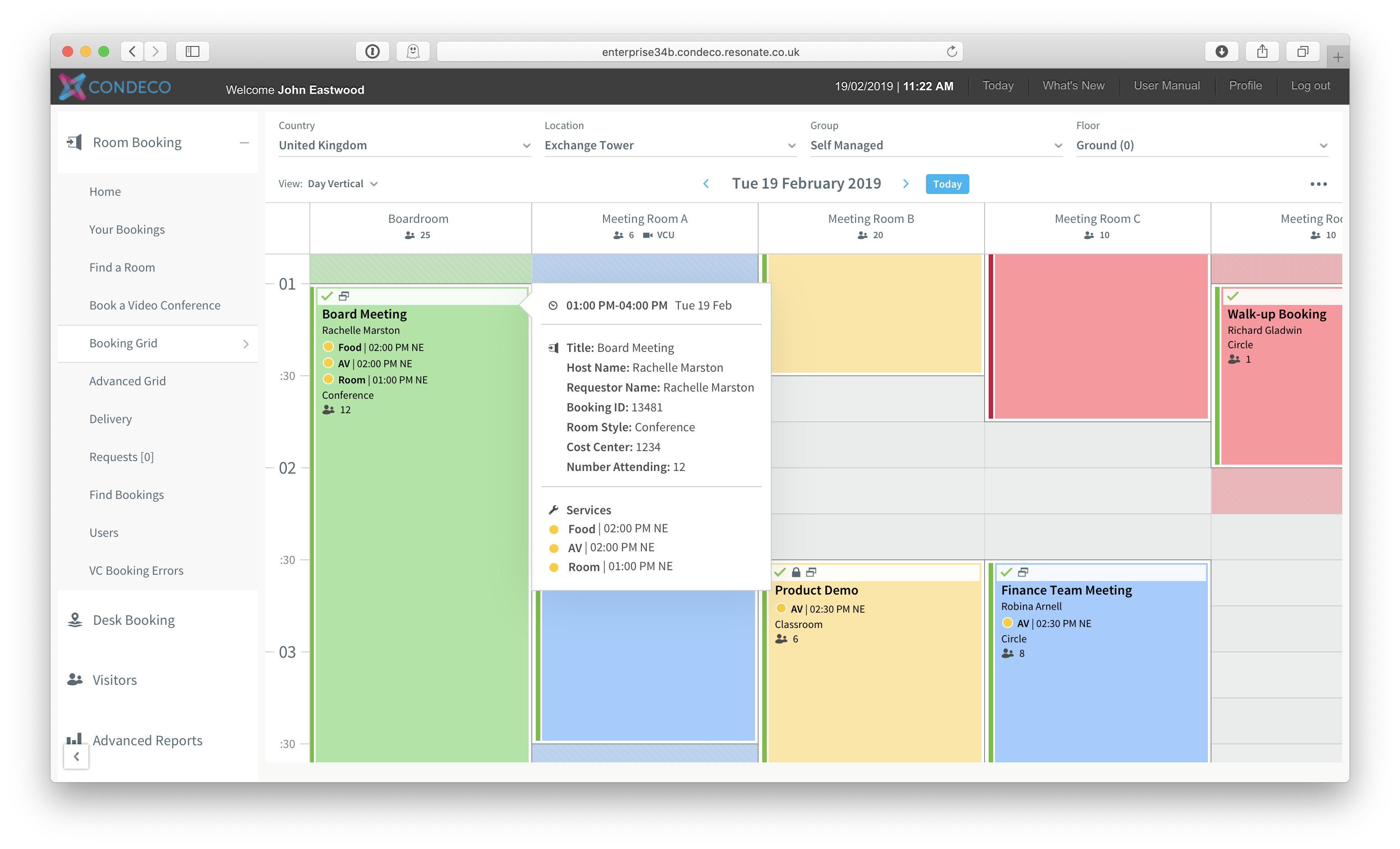 Read, “Colour enhancements to the booking grid” to find out more about the latest updates and enhancements to the Condeco room booking grid.